Three Ways to Improve Your School Website

We know that managing your school websites is a lot of work. Your website is a central hub of information for your school staff, your students, and their families. Luckily, we've put together a quick list of three ways to improve your school websites for your community!
1. Keep Your Audience First
One of the biggest mistakes we see at Rally is someone creating website content that they want to see without thinking about what their audience wants to see. When writing content for your school website, keep your audience first.
Consider who you are writing content for and what information is most important to them. For most schools, the most important audience is parents of either current or prospective students. They might be looking for information about how to register their child at your school, how to sign up for bussing, or your school calendar.
Who is this website for? What do they want to see?
Write content for that audience: keep it clear, simple, and free of jargon. Visitors to your website want to be able to find and consume information quickly. When that information is overly complicated, they can get frustrated. Want to reduce unnecessary calls to your school office? Make that information easy to find and understand on your school website! To make the most of your website, ensure that your content is presented in a way that is easy for your audience to understand. Parents (especially prospective parents) might not know all your school acronyms, so make sure to spell them out the first time you use them on a page.
What are parents searching for on school websites?
2. Choose the Best Images
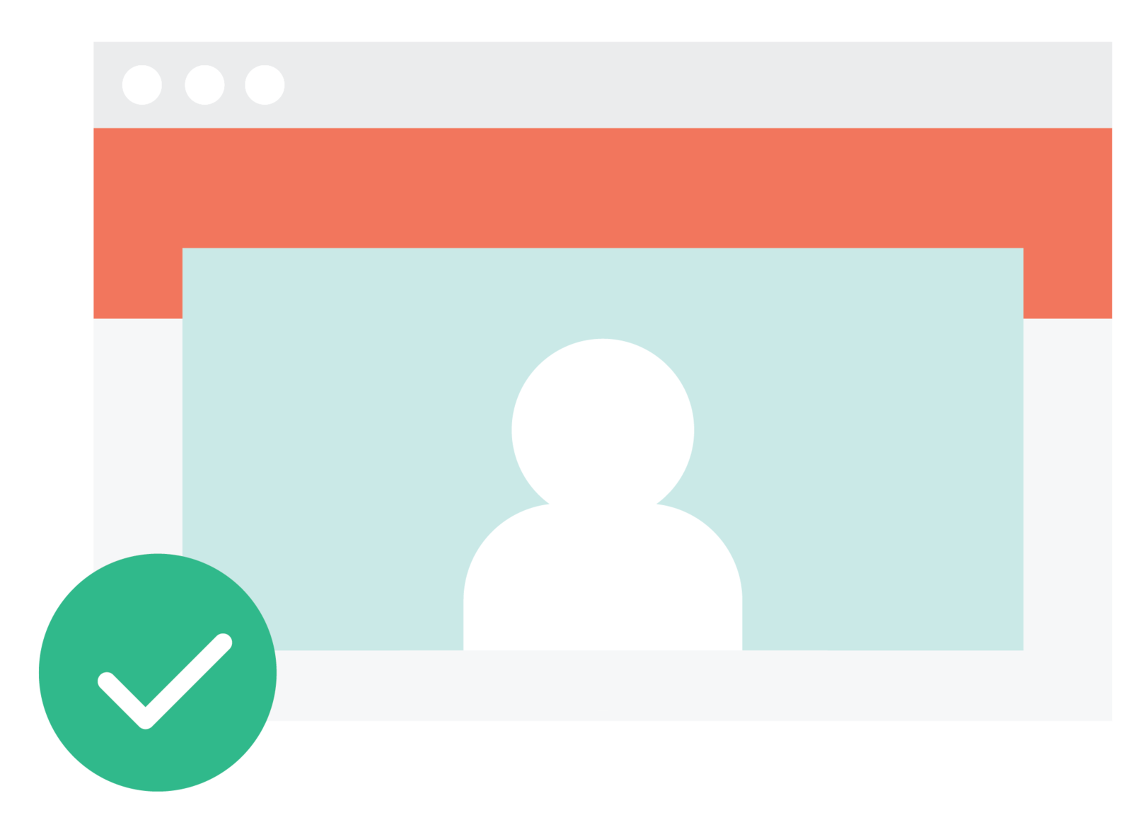
The images you share on your website have a big impact on visitors' experience. The right images help the rest of your website shine.
Whenever possible, use authentic images of your school's staff and students. Check with your school district office for your district's photo permission guidelines. Keep that parent audience in mind - what images will add value for them? A stock image won't resonate with them the same way a picture of a school BBQ will!
Another good practice is to know the aspect ratio for important images on your website. An image’s aspect ratio indicates the best dimensions for an image for that space and helps keep that image from being oddly cropped or pixelated. While you won’t have to worry about aspect ratio in most places (especially on your Rally websites), you’ll want to make sure that your eye-catching images on your home page are properly sized and that your staff portraits aren’t cut off. As a general rule of thumb, keep your subjects centered in your image, and a well-built website will take care of the rest for you.
Watch for copyrighted images. Always ensure you have permission to use images on your website.
Lastly, keep images...images! We know it's tempting, but don't add text to your images on your website. Websites have a place for text and a place for an image. Your images should complement the text on the page, but text does not belong in the images themselves. Use images that make the text on your webpage easier to understand or more eye-catching to web visitors, not as the primary means of communicating that information. Text on images is also difficult to read for users viewing your website on a mobile device and makes your website less accessible. Software that reads websites to users can't read the text on your images, so these users have no way to receive the information.
3. Keep Navigation Simple
Your school website shouldn't be a maze! Ensure visitors don't get lost by providing clear directions: page titles, headers, calls to actions, and a clean site map.
Keeping your page titles short and clear helps readers find information quickly and easily. If your page titles are too long, users won't be able to read it clearly on your site's menu: they won't know what the page is about until they click on it. Have you ever clicked on a page without knowing what content was on it? (Neither have we!)
Make use of headers and clear calls to action to help your audience navigate through your website. Headers, like the ones used in this post, help your readers navigate to what's most important to them without having to skim through lots of content. Choose headers that summarize what the rest of the content is about to help keep readers grounded on the website. When directing parents to perform a specific action, such as clicking a link, make that link stand out by styling it as a button. This style makes it easier to see and separates it from the rest of your content, but if you use too many buttons, your readers will become confused and overwhelmed. Creating a link library page on your website is a great way to have a lot of important information all in one place without overwhelming your audience. Use a quick links section for external links to keep them out of your website’s main menu.
We recommend no more than three layers of navigation.
Keeping your menu organized and not too long also helps users to navigate through your website easily. Three layers of navigation gives your website lots of flexibility with content without too many deep corners for users to get lost in. You want users to know where to find content - and to be able to find that content again on a future visit. Rally recommends no more than three layers of navigation with 6-8 top level pages on your menu and no more than 8 second-level pages in each section. Structure your menu around what your audience wants, and they won't get lost.
By keeping your audience first, choosing the best images, and keeping your navigation simple, you can improve your school website and help get vital information to your community faster!